10 Jan Website Homepage Design
A well planned website homepage design is essential if you want to improve your sales, leads and conversions. Get this ‘right’ and your sales will soar. Get it wrong and.. well, you get the idea 🙂 Invest the time to strategically plan your homepage design layout and everything else flows from there. Watch today’s video now –
Transcript of Video:
Good morning. Good afternoon. Perhaps I should even say good evening. Whatever time it is, wherever you are in the world right now, hello. Thank you for taking the time to come and join with me. My name is Paul Barrs from paulbarrs.com. Now, today we’re talking about the homepage of your website and how you can improve things, not just to get more leads, but to then also convert more leads, whether it’s sales, leads, or just more business overall through your website.
And I want to start out with a small caveat. Simply this, the homepage’s goal is not to convert the customer. The homepage’s goal is to get people deeper into your website, into your product pages, into your service pages, into your information pages, which explain what you do and the benefits of what you do.
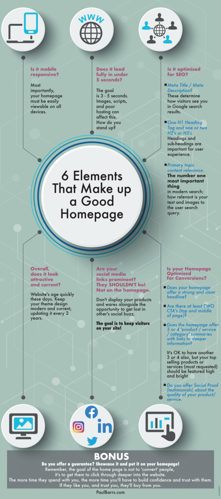
The homepage’s goal, know this first up, is not to convert the customer. It is to get them deeper into the site. And I’ll explain that a little bit more as we go. But let’s have a look at six incredibly important things, things that you must make sure you do not miss when it comes to the homepage of your website.
Mobile Friendly
Got your pen and paper handy? Let’s get started. Number one, and this is all to do with user experience. Is your homepage mobile-friendly? What do I mean by that? We open it up on the phone? No, there’s a whole lot more to it than just that.
It’s when we open it up onto a phone and the user experience is just as good there as it could be, would be, or should be on a PC or a Mac or even a tablet. You see, looking at the different device sizes that we use these days, it’s incredibly important that you go back from time to time and review your homepage on all of these, especially after updates and changes have been made.
If you’re using a CMS, like WordPress, don’t rely on just the fact that the theme is supposed to be mobile-responsive. You must check to make sure that your website is viewed beautifully and that people can easily see your information and links deeper into the site and your call to action and so on, on different mobile devices.
That’s number one. Now, number two has also a lot to do with the user experience and, again, the mobile experience. Does your website load quickly? Now once upon a time, the benchmark for page speed (load time) here in Australia was five seconds. Well, now Google says it should be three seconds.
So I’m going to give you a little latitude here and just say three to five seconds, not just on the PC, not just when you’re plugged into the wall, not just when you’re at work and you’ve got access to high speed. How about on the mobile? How about on the 3G for those who still use it, 4G for most of us, 5G for those who have upgraded a little further?
How well, how quickly does your homepage load at different internet speeds? Three to five seconds is the benchmark. Can you improve on that? Now, let’s look at number three. It’s SEO, search engine optimisation. Is your homepage optimized for getting found in search? Not just that, but also receiving traffic from search?
Because getting found is one thing. Great, but what if you can’t get click-throughs from search? And we’ll use Google as our prime example here. On your homepage, you need to make sure you optimise the meta title and the meta description. Typically, in Google, that will be the main heading and then the paragraph, two or maybe three lines of information that show up under that main heading in Google search results.
Now, you can optimise that, but you’ve got to be careful when you’re optimising that and think of user experience. It’s not just about what you do. It’s about what the customer is looking for and what you can do for them. That’s good search engine optimisation. So it’s meta title and it’s meta description.
And, yes, there’s a bunch of other things which I’ve covered and will cover again in other videos. But from a user experience point of view, that’s what we’re talking about today, making sure that you’ve optimised your title, your description, and they land on the website, bang, there’s a good heading. They know they’re in the right place. And that’s the type of optimisation I’m talking about.
First Impressions Count!
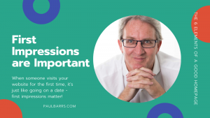
And then from there, we move on to number four. Four is, does your website overall just look attractive? I want you to compare it, literally compare it here to your competition and compare it to the date, the time. Right now, is your website current? Does it look fresh?
Does it look appealing? Is it attractive? If you compare it to say three, four, or five of your competitors’ websites, which one looks like they’ve spent a bit more time on it? Do you meet the grade, or have you just slapped something together, really quick, really simple? There are many things, and when it comes to your homepage, this initial impression, it’s kind of like, you know, meeting on a date.
Yeah? We here about the date. Oh, yeah, I’m going to go on a blind date. We know what we want. We’ve gone to Google. We’ve gone for the search. We know what we want, and then we click through and we’re at that dinner date and here’s your date sitting across the table from you and, oh boy, he or she doesn’t quite meet up to our expectations because we had a couple of other dates a few weeks or a few months ago, and well, they were so much better.
Those websites were up to date. They were more functional. They seemed modern. They seemed current. Yours missed the boat. So you didn’t get the second date because, well, you didn’t make the grade on the first. And that’s how it works also with our homepages.
It’s that dating process, where we make a two-second judgment, three to five seconds maximum, which is why load time is so incredibly important. These things are crucially important. So take the time to have a look at your competition’s websites on a regular basis, each four or five, maybe six months.
Take note of who’s updating. Take a screen capture of your competition’s websites and pull them out of their folder and have a look and see if they’ve done an upgrade. And if it’s just one, okay. If it’s just two, maybe. But three or four, you’ve got to catch up and make the grade. So, so important.
Now, number five on this list, this is one you may not have thought of. It’s to do with your links to social media. Now, we all know we have to build a tribe, and we’ve got to have a following, and we need to have our business page and this wherever our audience might be out there. Yes, that is true. But what is the purpose of having your tribe and having your audience out there in the social media sphere?
What’s the point? The point is to get them back to your website. So number five is this. Are your social media links, your profiles prominent on your homepage? Well, if they are, they shouldn’t be, because the last thing you want to do is get and spend time and money getting people to your website just for them to get distracted going back to social media.
I mean, it works like this and I understand, a photographer, “I want to display my photos from my Instagram and have my latest work up there fresh.” Great. Well, put it up there, fresh in a little small gallery on your homepage and have them click deeper into the site to read more, but don’t put your Instagram feed there, because they’re going to click through.
Then they’re on Instagram, “Oh, I’ve got some notifications. Hang on then. I’ll be back in a second.” And they don’t come back, do they? They don’t come back. They walk off. That’s like going on a date and she says, “Oh, hang on a minute. I just want to see … I’ve got a second date over here somewhere. He’s not expecting me.”
No, you don’t want to do that with your business. That’s suicide. So make sure that your homepage has just one goal — to get people to go deeper into your website, your website. There should be no links to anywhere other than deeper into your website on your homepage.
Think about that for a minute and then go and make sure that that’s the case. We’ve all been guilty of doing that one wrong. Please don’t do it anymore. And number six on this list, this is now so important. We’ve all talked about that user experience, good for them. Let’s talk now about good for you.
Website Conversions and ROI
Is your homepage set up for conversions to draw people deeper into the site? Now, there’s a number of different ways to do this. We’re not going into the details of conversion optimization today. We’ll do that another time. So if you haven’t yet, like and subscribe and follow me, become part of the tribe.
But let’s talk about your homepage and its conversion. If its goal is to get people deeper into the site, how do you do that? Where do you do that? Here’s my best suggestion. If you’re an e-commerce website, you should display your top categories, not all of them, your top categories up nice and high. So you’ve got your above-the-fold area.
That’s what they see when they first arrive. With one scroll, then they see your top categories, because that’s where 80% of them are likely to go, using the 80-20 rule. You will make most of your money, 80% of your money by serving that percentage of customers who will, what? Respond to the greater majority.
Can you make everyone happy with that? No, but the most of your money, your income will come from that. So not just products, maybe some specials, but your categories. The specials should come perhaps just after that. And then other things and features as well. But if you’re a service-based business, like I am, well, you’ve got your above the fold, that very, very first section, which says this why you’re here and this is what we give you.
They make one scroll, then they see my primary services. Not all of the services that we offer. I mean, as a small agency, we have everything from domain name registration, through to website hosting, through to upgrades, through to migrations, through to SEO, digital marketing, Google ads, Facebook ads.
Only showcase those products / services that make you the most money!
The list goes on. But I only showcase on the homepage, the 80%, about three-quarters of those primary products or services, in my case, that produce the best result. There’s a menu up at the top, for those who also want to have a look up there.
There’s further information, perhaps down at the bottom, somewhere down there, for those who want to have a look down there. But right there, scroll one, bang. And so what do I do? I ask them to go deeper into the site. And then if they scroll again, they’ll get a smaller sample, and I ask them to go deeper into the site. And if for some strange reason, they want to scroll even further, guess what’s at the bottom?
Little tidbits and bits of information on all the products and services, asking them to go deeper into the site, because that’s the goal. And I set up tracking links and tags and so on, so I can actually measure the conversion rates of the homepage. That’s important.
All right, folks. There’s so much more we could do. Hey, I’ve got an offer for you. If you’re here in my local region, somewhere in Southeast Queensland, maybe a bit further on the east coast of Australia or, hey, anywhere, let’s just go anywhere in Australia in today’s day and age, if you’re here in Australia and you’d like me to have a look at your homepage of your business website, click the Contact button there, get in touch, book in a call, and I’ll give you a call back, and we’ll go through it together and I’ll say, “Yes, this, this, this. Oh, that could be fixed. That’s great. How about one, two, and three though? You could do better there.”
So there’s an offer for you. And I’ll do that, absolutely no cost. We’ll hook up on Zoom, and we’ll do a screen share and we’ll go through those points. I’d like to help you with that because there’s so much competition out there. There are so many others in your industry, in your sphere, and they want to take your customers. Here’s my best advice.
Stop that, stop that, stop that. Start taking theirs. Okay? Get proactive. Don’t get aggressive, but get proactive, progressive and improve on things along the way. All right, folks. That’s all I’ve got for you in this video.
So much more I want to share, but we’ll do that next time. My name is Paul Barrs from paulbarrs.com. Thank you, thank you so much for taking the time to come and join with me. We’ll talk again soon. Bye-bye.
Homepage Design Infographic
Infographic: Click to View Larger Image in New Window

