The 6 Elements of a Sexy Website
Six Ways to Help You Convert Your Browsers into Buyers!

Men on the other hand are much more easily pleased… we like it simple: boobs and bums, maybe legs as well. It goes back to our primal instincts (like that of the baboon!).
Whatever it is that attracts one to another it all begins with the very first glance, often before we’ve even met – a glance at a distance, the look over a shoulder, the smell of perfume or cologne as it passes…. There’s always something that sparks an interest the very first time – often before you even know each other.
And so it is with a sexy website.
The first element of a sexy website is what people see before they even “see” you.
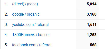
There are many different entry points into your website (where people can ‘see’ you but have not yet visited your website); to find out yours all you need to do is look over your Google Analytics referring traffic report. As can be seen from the following graphic my top 5 traffic sources this past reporting period has come from a variety of different sources; direct traffic, Google, YouTube, 1800 Banners and Facebook (yes, it’s still worthwhile “testing” banner advertising. In this case I was testing conversions to a free course; and while Facebook ‘delivered’ less traffic, it converted twice as much for similar cost).
On each of those different entry points however, my website was presented ‘differently’, according to the market that it was targeting.
For example, here’s how it looks in Google –
That’s how my site looks in Google when someone searches for what I do, “internet business training”. The point being… is that “sexy”, well, no – it’s business stuff! But to someone who wants to learn how to make their website profitable and get better results online – YES. My title and description tell them exactly what I do and how I can help.
You must craft your own ‘entry points’ so that they do the same for you.
Take the time to look over your own top 5 referring websites and then take a closer look at how you are represented in each of them. Are the words and images used to showcase your products / services doing the best they can? Can you improve on them? Then do so.
Your goal here is to attract and pre-qualify potential customers. Don’t try and sell them, don’t pretend to be the only one in your industry ‘doing’ what you do (i.e. “I’m the best at…”) simply TELL THEM what you will do FOR THEM.
All you want them to do is click the link that sends them to your website.
The second element of a sexy website is that it offers an INSTANT CLEAR MESSAGE when they get there.
Specifically, I’m talking about BEFORE they start to scroll down or look around.
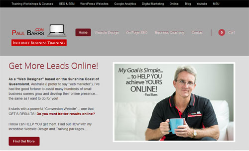
Take a look at the top section of PaulBarrs.com… once again, it’s hardly “sexy”, and I’ll admit, there’s not much more I can do with my mug shot up there – but that’s my brand, and it clearly states what I DO (and what my potential customers are looking for).
Training, SEO, WordPress Websites, Google Analytics… basically all things to do with Digital Marketing.
Are these things “in line” with the different entry points on my website (do you think that when someone clicks through from Google where my meta-title says “Internet Business Training; Web Design, Marketing and SEO” that my website offers the same thing…?
Absolutely! And that’s what makes it SEXY. People come here looking for one thing specifically, and that’s exactly what they get. There are no tangents, no false promises – it’s all about aligning expectation with opportunity.
You can apply the ‘sexy’ to your website when you take the time to consider both your own goals and your customer’s goals, and align them.
There’s nothing worse for a customer then to click through to someone’s website only to find they didn’t get what they were looking for. This can be one of the primary reasons for a high bounce rate in your analytics (not the only reason though).
Your goal with this 2nd ‘sexy element’ is to make sure that what the customer expects to get when they arrive on your website (based on your promises of what was projected at their entry point) is exactly what they DO GET.
Make them feel wanted, make them feel needed… make them feel like they’re in the right place!
The third element of a sexy website is that you make it EASY for them to get to where they want to go.
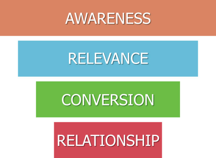
Customers have problems. Those problems have solutions. You need to provide them.
Image Source: ltnow.com/relationship-focused-sales-marketing-funnel
Could you bundle up your products or services into two or three primary categories? If you can, then you should. It makes it easier for people to find what they’re looking for.
In most cases, our customers know exactly what it is that they’re after; they want to get help doing x-y-z or they want to buy x-y-z. Your site should be set out with clear pathways from your home page to your information page to your contact / order page.
Straight to the point!
If you offer a shopping cart then make it a primary focus and again, make sure that you have clearly set categories.
When doing this you should also be mindful of your top entry pages (you’ll also find this in your Google Analytics reports). Look at those entry pages and look at their bounce rates… are the bounce rates ‘higher’ on these pages by average then others? If so, then it’s possible that one of two things are going wrong – 1.You’re getting the wrong kind of traffic to the page (the description prior to entry isn’t targeted enough), or 2. Once people get there you’ve made it too difficult to get to where they also might want to go.
You’ve got to make it EASY for both you AND your customer to achieve your / their goals. You want a new lead / new sale, your customers wants to learn more / buy.
Look at your sales funnel and make sure that it’s no more than a few clicks from point A to point B.
The fourth element of a sexy website is that you have strong headlines!
Headlines count for everything online; and like a good looking guy or girl, they are almost ALWAYS the first thing that you look at when you visit a web page – that’s if they’re a good one anyway!
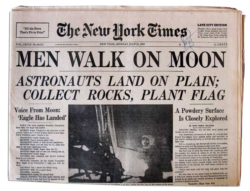
The purpose of the headline is to grab the reader’s attention and draw them deeper into the page – the same way they do in newspapers. Most people read the same way; we scan the page looking for something to grab our attention.
Show them the Problem and Then Show them The Solution!
That’s a super simple way to put it, but that’s “it” in a nutshell. A good headline focuses on either the problem or the solution, a great headline reveals both.
Studies have revealed that on average that EIGHT OUT OF TEN PEOPLE will read the headline, but only TWO will read the rest; meaning the effectiveness of your entire page rests with those few words right up the top!
What is the purpose of each headline…?
It’s to get the next section of your piece read.
Here are my top tips:
- Always write your headline first, and then write the rest of the piece to live up to it.
- Make it completely clear (what you’re writing about), don’t confuse your reader.
- Focus on the W.I.I.F.M. (the “what’s in it for me” formula). Focus on the benefits.
- Numbered lists make great headlines (6 ways to… 5 simple steps…) etc.
- Keep it short and sweet.
If you can grab your readers attention long enough to make them WANT TO keep reading, your chances of converting them from a browser into a buyer are increased exponentially.
The fifth element of a sexy website is that you have a CALL TO ACTION on every page.
This is a tough one, especially if you already have a large site. But if you don’t start now, it will NEVER get done. Start with the most important pages and then work your way through.
Image Source: http://www.uxbooth.com/articles/good-call-to-action-buttons/
How to order your call to action pages by priority –
Start by looking at your analytics; chances are your most visited page is your home page – look at it and ask yourself the question, “Does my home page clearly reflect my goal to achieve X?” (Whatever your goal is: subscription, shop sale, contact etc.) If it doesn’t, make sure that it does.
The ‘goal’ of you home page is to direct your visitor to your conversion page / s, unless of course you have JUST ONE GOAL in which case the home page should set to achieve it.
Once you’ve done that, use your analytics to determine which are your next highest traffic pages – if your home page is set up correctly than these will be your call to action goal pages (the ones that the home pages directs visitors to).
Or, they may be your next highest count ‘landing pages’; in which case there must be a strong CALL TO ACTION to guide your visitor to your ‘goal pages’ (your subscription form, your shop etc.).
Get the idea?
Eventually, ALL your pages which receive significant traffic must aim to guide your visitors to a conversion page. This is done with a call to action to go deeper into your site – then buy, or contact or subscribe – or whatever your goal is.
The sixth element of a sexy website is that you have built in FOLLOW-UP systems
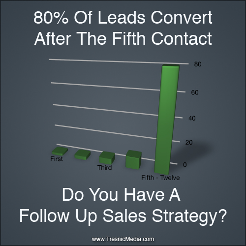
This sixth element can easily increase your conversion ratios by as much as 30% if done right. If you’re not doing this already you may as well be taking all your efforts and throwing them on the scrap heap.
The strategy of ‘follow up’ is the foundation keystone to ANY sales and marketing campaign.
Image Source: http://tresnicmedia.com/why-you-need-a-follow-up-sales-strategy/
It is widely known that repeat customers cost less and earn more than the costs of bringing new customers into a business. I want you to apply that to the strategy of bringing first time visitors to your website back a second or third time. It costs less, it’s far more effective and the facts are that the more often they visit your website the more likely they are to buy from you and become a paying customer.
Three areas where you should be following up –
1. When a new visitor subscribes to your newsletter / auto-responder (easily automated)
2. When a first time contact submits a query form for a personal reply (whether they appear to be a genuine lead at that time or not).
3. After a sale is made – add them to your customer email database and schedule regular contact.
Depending on your business follow up conversions can come days, weeks, even months later – and can be worth thousands of dollars when they do.
Just this past week I had a prospective client contact me 47 weeks after our last contact; that is, our last “personal contact”. Back then, once I realised that she wasn’t going to convert straight away, I asked her if she would like to receive my weekly Quick tips Newsletter… and each week since I’ve been in her mailbox. Now that she is ready to move forward, she thought of me before my competition.
Consistent, persistent, never-ending follow up… the KEY to business success.
So there you have it, the six elements of a SEXY website!
What is it that makes it sexy?
- It’s the way that it attracts browsers to it and converts them into buyers.
- It’s the way that it looks at the problems that people have and provides solutions to them.
- It’s the way that it builds trust and encourages loyalty from its visitors… so much so that they can’t help but become customers.
We buy from people that we know, that we like and that we trust.
If you always look at things from your customer’s point of view, you’ll be sure to see things in the new light of honesty and integrity. No longer will you seek to ‘get’ from your customer, but instead find ways to ‘give’.
When you do this, your products, services and offerings will be so attractive to potential buyers that they won’t be able to resist.
That’s sexy!
– Paul Barrs

